
Sometimes seeing is not believing. I am thinking of when maps are presented to show the results of an election. Take the 2017 UK parliamentary election for example. A standard map projection of the UK, the type we are used to seeing in any atlas, shows England almost entirely Conservative blue. Ignoring the other parties at the moment, Labour red only appears in small packets, around London, South Wales, the M62 corridor and the North East.
We know however that this does not reflect the actual result where the Conservative Party ended up with just under half of the parliamentary seats. The standard projection gives a distorted view because, in a huge generalization, the Conservatives tend to win in constituencies that are more rural with greater area and less densely populated, while Labour tend to be successful in constituencies that are more urban and more densely populated.
I live in Northumberland where Labour lead in the south eastern part of the county, the former mining areas and the Conservatives lead in the two rural constituencies. On a standard map projection blue is the predominant colour.
My view is that gives the impression that one party is much more dominant than it really is and would like to see greater use of different kinds of projections when presenting political information.
That’s why I was delighted to be pointed at the article ‘Cartographic perspectives of the general election’ by Dr Benjamin D. Hennig, Associate Professor of Geography at the University of Iceland and Honorary Research Associate in the School of Geography and the Environment at the University of Oxford.
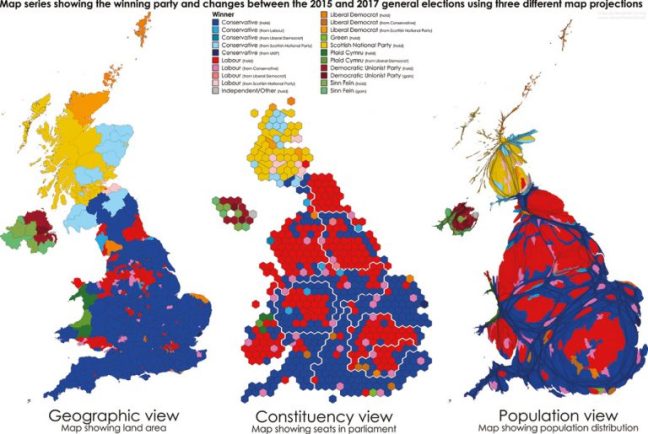
Three projections are shown giving a breakdown of the 2017 election, the geographic (or normal), the constituency view and the population view. The consistency views show all constituencies as if they were exactly the same size, while the population view shows constituencies resized based upon the number of people within. Both show a more even spread between red and blue.
When it comes to political representation I would suggest that the constituency view is always used on television and in the printed media, as it more closely represents reality in terms of the make up of parliament.
The article can be found here.
